Thursday, 10 October 2013

Element of Surprise


For the next workshop, we were referred to the red book of texts and in particular, the fish article. This was a list of names given to groups of different species of fish. This was interesting as there were many different names for different groups of fish.
We were aced to pick a species of fish and develop some understanding of it's aesthetics. to do this I drew many different sketches and different angles of my chosen fish, which in my case was the saw fish. I chose this fish as it looked interesting as well as original and unlikely to be picked by anyone else in the group. This would prove to make interesting illustrations because people would notice it above other types of fish and I could utilise this to create a better illustration.


Here are some images i researched and found relating to the sawfish. I did this too get as accurate as I can to the true proportions and sizes of these animals.


I think these sketches show my development towards gathering a good grasp of how the sawfish look.
The next task was to create a repeating pattern involving the fish. 


These are the studies of the sawfish that I produced in different styles to present my gained knowledge. I feel these are successful and bear a true resemblance to the real creatures. I also tried to create each illustration individually and uniquely. I feel I achieved this.


These images (above) are the same digital drawing and I have replicated and edited to look at a variety of colour designs. I feel they look like legitimate illustrations and are professional as well as get across the natural design and shapes of the saw fish.


These three images (above) are my attempt at another uniquely styled illustration of the saw fish. I used a new technique to create the shapes and lines on the two right images which i I feel look like old, japanese ink style pantings.


I wanted to do a variety of different styles, so played around with colour variations and colouring methods (above) I think these images aren't as successful as the first few sets of illustrations.


These two illustrations (Above and below) I created on my phone on a painting app. I think the style and proportions work well together, as they are a little chunky and look cute, as well as being accurate to the reality of their design. I also like the effect of when I used the rubber tool to go over certain areas to create a sense of shadow and depth on the texture.


For the pattern of fish, I began to think of ideas of an underwater scene of the sawfish surrounding their prey in an almost comical way. This would give a comical approach to these animals as well as presenting their physical structures and deigns.


My next idea was to design a flat, silhouetted I'm image of these animals which i could then copy and fit together in such a way that at first glance, the audience doesn't see the fish, only the pattern created.


I took my first design and copied it to create an even more complex image that removed the actually aesthetics of the saw fish form the image even more. At first, you don't se the fish, only the pattern and negative space created by their design. I think this is successful and is what I was looking for in terms of design for this pattern idea.


I took a screenshot of a smaller section of the big compilation of images to get a closer look, as well as to see the contrast from the background and the images of fish.


After revisiting my pattern a few times, I decided it did not meet my standard of work or represent my abilities and style of illustration. I looked back over my sketches and ideas and found this design of sawfish i created form reference images. I changed around the colours and layout to create a board of sawfish. I feel this image is more successful than my first idea as the use of colour and the pallet really lends itself to the design. The contrast of the blue and pinks remind me of the texture of fish and seafood. I also feel the red sawfish adds a twist to the image and brings it out more as a piece.

I decided to look back over this workshop and the finals I produced. I feel that this final illustration does not represent my style and work as well as I had hoped. I wanted my final to be unique and have another layer of depth to my work. I revisited my ideas and sketches and thought some angles I studies of the sawfish made it look like a jet/plane, mainly because of the position of the fins and tail. I thought this could be an interesting area to expand upon. I then researched images of the red arrows and their formations, as the idea of this piece is for it to be a pattern and to have a twist to the image.


Fred Gemballa


From the images and my sketches, I came up with this digital sketch of the sawfish in the red arrow formation and added the trails behind them to see if this illustration could work in terms of about and dynamics.


My next step was to add simple layers of colour to the image, building up shadow and shape. I also made the fish red, to link with the red arrows a little more. I may even look at putting roundels on the side of the animals .


After going over all of the fish, I decided to look at colour options and wanted a backdrop that fitted with the idea of these fish flying like planes, as well as them being underwater, so chose a pastel turquoise.


I also decided on adding another layer of shadows on the fish, I think this improves the design of the illustration.


I wanted to bring the designs off the page a little more so added an outline to the designs. I think this black outline is probably too dark, so practiced and found that a darker shade of red than used on the shading works well.


I then applied this dark outline on the rest of the sawfish.


I also practiced with the background and looked at various gradient techniques. I don't think i'll use these colours as they're too vibrant and take the attention away from the layout of the sawfish.


As the brief specifies that there is an element of surprise required, I looked over my design and thought that simply being juxtaposed as jets may not prove obvious enough to be the element of surprise. So I decided to review this idea and wanted to include something in the space below the six fish. I thought another fish, coming at the audience would look well in this place, after continuing with this idea and adding him in, I feel it was successful and works well in contrast to the other fish that are all at side angles, where as this fella is coming right at you.


I mentioned I wanted to make the link to the red arrows more obvious, so looked at including a roundel to the design. I think the colours I used work well. But i'm unsure about the placement and overall look of the design including the roundel.


Continuing with the backdrop, I wanted to have a more subtle and loud background, but also one that could look either like the sky or under the ocean, leaving it up to interpretation, and flowing with the red arrows references. I think the trails of smoke look good, as they aren't as obvious and cartoony as my last attempt. I also tried some of them in red, but thought that also looked too eye catching.
I now want to look at the illustration with all of the animals bearing roundels . 


Here's a screenshot of the illustration including the roundels on the sawfish to further communicate the reference to the red arrows. I think that it looks interesting and would confirm the similarities and that that is the juxtaposed look I was going for with this design. However, on further reflection of the whole piece, I feel there is a lot of spare room around my design. I will now look into making the background smaller or adding subtle objects into the frame to help with this problem.

When talking to peers and in my tutorial about these pieces I discovered that a lot of people thought that  the roundels looked very much like the fish's eyes and that they were just very big. I couldn't get my head round this idea and tried to see how people could think this, even though everyone thought they looked like eyes, but just couldn't see it myself. I looked at ways of conquering this problem to stop people thinking this about them.


Another think that was suggested by my tutor was the idea of having bubbles in the background. I thought this could look quite cool if they were very subtle, so i tried with them in to see how it goes.

A problem that I encountered was that I had accidentally drawn all the roundels in the wrong order of colours. This meant I had to quickly change them to be correct.


I wanted to look further into this idea, so tried thinking of another method of portraying these fish as jets. I found this image whilst researching how red arrows look, and liked it so wanted to do a quick piece based on this photo.

I started with a very rough sketch of the layout to work onto of of this illustration. Just to get the basis and layout in proportion.


I created this piece by playing around with different brush strokes and trying out different thicknesses and strokes. I found types that were suitable for different parts of the image. Such as one brush and thickness for the outlines of the clouds, and one type of brush for the stream of vapour behind the fish.

I also tried different varieties of colours of the fish and streams to see if it altered the dynamics and visuals of the image at all. I think these two images look very cool as side pieces, but I doubt I will follow them up with any more work as I need to carefully balance the remaining time for the workshops.


I looked back over advice given to me by tutors and peers and dealt with the suggestions about the eyes of the fish. I did this by making the real eyes more noticeable, by making them bigger and darker, as well as making the roundels a bit transparent. I feel that these two techniques combined create the desired effect and stop the mix up between the two.
Another suggestion was to create other images of the same fish designs, but with different layouts and displays.


It was suggested by my tutor to look back over my final and do some more designs involving the already created characters and lay them out in new displays. I tried this and decided to include the images beside the original. This adds another sense of balance and weight to the images when shown together.


For my final, I believe I have finished the design successfully and made the right decision in terms of the side images being incorporated. I feel that I have successfully responded to peer and tutor feedback. Especially in terms of the eyes and roundels being confused with each other. By taking steps such as making them more transparent and moving some of the roundels to the top of fins, as well as making the real eyes darker, that this issue has been tackled. I feel that I have fuelled the brief correctly by taking my chosen design of fish and incorporating it into a situation that gives the context an element of surprise. I have taken my design further and am happy with the results. I feel this design would belong in an article beside text and is very successful in terms of theme and colour palette.



Shelter


BRIEF

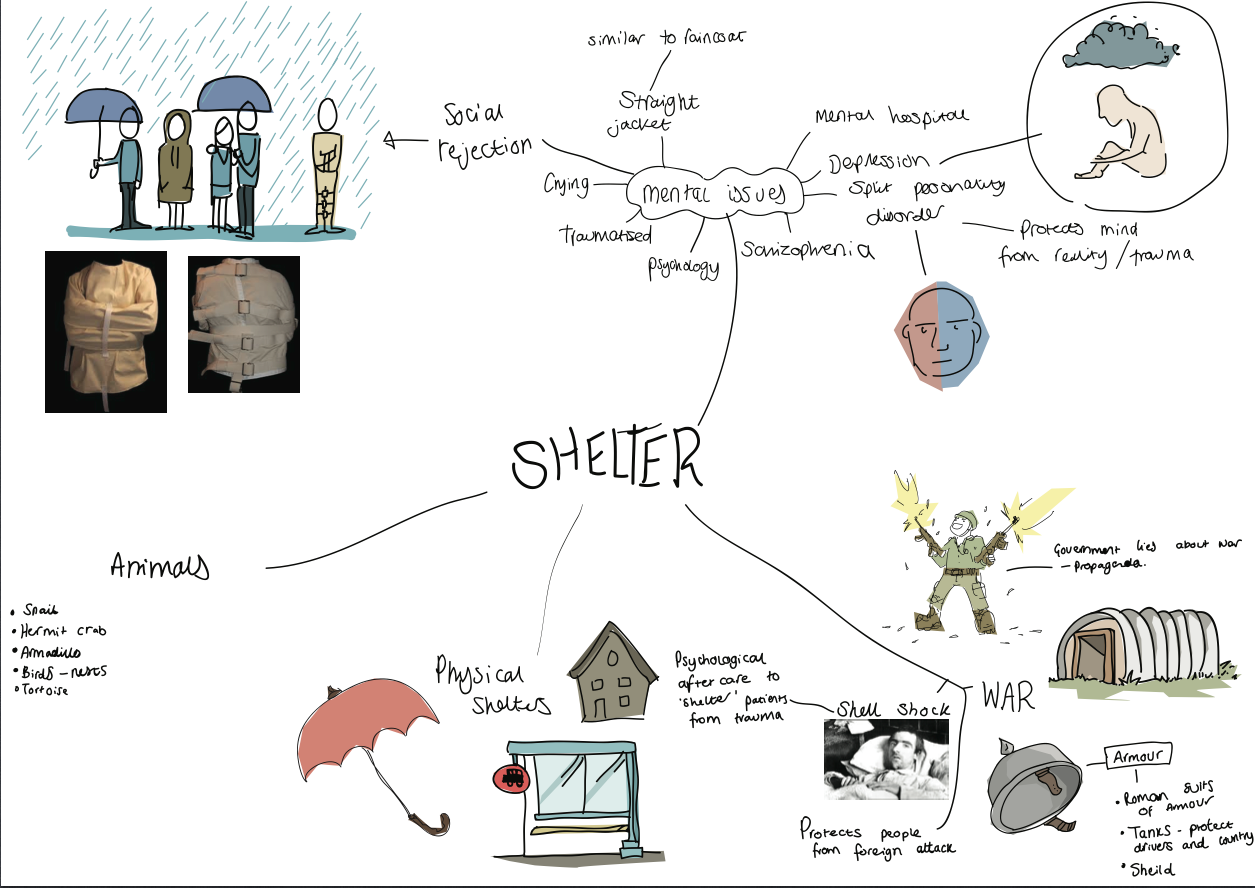
For this first workshop we were given the text extract from the "Red book of texts" 'Shelter'. As this is a broad word and can have many meanings, the first response was to create a mind map, to stimulate ideas and thoughts behind what possible illustrations can be done to link with this topic. As a group on our table, we came up with many ideas and possibilities for what the word Shelter could mean.


We had various ideas that stretched from homeless shelters to World war 2 bunkers. This wide variety of ideas was helpful and helped us choose an idea that appealed to us and our style of illustration.


From the large, group mind map, I decided to make my own with a little more depth into the areas and ideas that interested me. I researched images related to psychological issues, as there are many forms of psychological sheltering, such as depression, repression and developing disorders. I found images of straight jackets and felt these are recognisable and almost symbolise that area of mental health. I continued to illustrate some quick sketches of ideas of how I could portray what I wanted to translate.


I then thought about the other meanings of the word that interested me. I thought that the reference to war was quite interesting and that armour is used to shelter solders form harm, and that there are lots of different types of armour. I sketched a tank to see if I would be further inspired to continue in this direction. However, felt there would be no scope for easily linking the word shelter to illustrations of war unless it was made too obvious. Also I would rather look at other ideas.

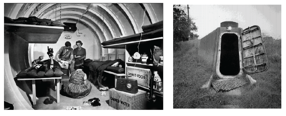
When looking at war and different types of 'Shelter's used in wars, I thought of bomb shelters, armoured vehicles, and other physical things, as well as non physical things such as mental protection from traumas and wars being used to protect innocent lives and gaining control of areas. However, for illustrative purposes, I thought it would be 'easier' and more understandable if I was to look more into the physical realm of ideas relating to Shelters. 
I gathered some reference images and did a sketch of a tank to start off the final ideas processes. I decided not to look at war for a while and maybe come back to it later.

I also came up with the idea to look at shelters in the natural world. This covered things such as shells and skeletons of creatures that protect them from the outside world, predators and any other damage.
I researched all the types of animals I know that have these features and thought about how I could translate this theme into my work.

Most of my successful pieces to date have included animals and a sense of humour. I think this may be because these are some areas in life that interest me and hold my attention, so i'm naturally drawn to thinking about these things more often than other themes. This is helpful as I can relate my style and knowledge of animals well to this project to design a piece good enough for my portfolio that shows how I work as well as how I can come up with good ideas and concepts based on little information.


I then decided to look at animals that I have greater knowledge on than most. These included tortoises and snails


I did some sketches based on my knowledge of tortoises and from some reference images. I was happy with the outcome of these sketches and how they look. I liked my technique of using grey to shade in large areas below the black pen line. I also like how day it is to create characters from animal's faces, by changing things such as the eyes and face shape, I can create a wide variety of characteristics.


I came up with the idea of combining two animals together, playing on the difference between both their shelters. I wanted to juxtapose the shell of a snail onto a tortoise where a tortoise shell should be. I feel this is a funny idea and would work well. Here are some basic sketches on techniques and styles I wanted to look at on the workshop day.

I looked at lots of drawing techniques such as using thick outlines, lots of dashes and lines to show surface areas and flat colours. I liked the use of lots of circles on the face of the tortoise which shows the texture of their skin as well as is visually appealing.


The brief specified that our illustration would have to be in black and white. Upon thinking about this more, I was happy for the workshop day piece to admire to these rules, but also wanted to create a piece for my portfolio. So could do one final for each. I decided to look at animals as I am confident when illustrating living things, looking at proportions and I also enjoy it.

From a combination of prior knowledge of tortoises (my girlfriend owns a pet one) and a quick look at some reference images, I came up with the idea of drawing a line drawing of a tortoise with the protective shell of a snail. This fits well with my style and use of humour and surrealism in my work. I wanted the style to be simple and cartoony and also to suggest the textures on the skin and shell with as little line as possible. I think this was portrayed well and had the intended effect.

This was my final image for the day of the workshop. I like the general outcome as it looks a little bit humorous and has a good style of illustration I believe. I like the thick lines and also the use of circles for the scales. I haven't thought about how I  can use this image for the pylon press cover yet though.


My next step was to further consider this final to look good enough for my portfolio, as well as create a piece that will work in/on the front of the pylon press booklet. I looked back over my original ideas, to get an idea with more substance to it, and more areas that I could use juxtapositioning in. I thought of creating more tortoises with things that aren't their original shells being used as shelters.
I used metal and the war references to combine my research and ideas about war being used as a shelter with the reference of animals having natural shelters. I think this is a good idea and works well. I wanted to continue with this experimentation so carried on thinking of ideas.
I particularly liked this image of the tortoise with a tank shell. I thought this was funny and had potential for further experimentation and development.


I wanted to redo my final, by thunking about having more context in my design, as well as a little narrative. This would make my idea look a bit more thought out and have room for potential growth.

I tried another new style, which involved sticking to a limited selection of brush strokes and using my old block colouring method. I like this effect so far (below) and would like the whole piece to be up to this quality of work.

From the idea of the tortoise changing shells and my illustration of the tortoise with the tank shell, I came up with the idea of the tortoise 'Upgrading" to a suped-up battle shell. This idea generally works well with my style and sense of humour. I wanted the quality of this image to be consistently high, so started with a sketch to slide below my work to build upon.

This was the first look at the final design and I felt that it was coming along nicely. I liked using different brush strokes and thicknesses to how I would usually work. This allowed my to get an interesting look and feel to the piece. I was happy with how it was turning out.


I then had to look at context and how I would position the about of the image. I know that it is human nature to look at images from left to right, as well as I wanted the image to explain a story that had already happened. So I wanted him walking away from his old shell, happy with his new one.

In this piece (below) he's walking away from the shell, however, the image as a whole looks off balanced, so I then wanted to try flipping it the other way to fix this issue.
I switched them around  to show him walking away from his old shell, giving the illustration automatic narrative.

I wanted to add something to his eyes, to give him more of a sleepy and dopey characteristic. To do this I played around with different positions of eyelids to see what works best. I feel I  made a good decision regarding this area.


When incorporating the new eyes and the positions together, I really liked the outcome of my illustrations. The next step was looking into backgrounds for this image.


For some reason I had always imagined this scene happening on a beach. This may be because I can add footprints to show where the tortoise has been, adding more clarity to the little narrative within the image. But it might just be because the colour pallet would work well on a beach.


After gathering a few reference images, I tried to make a backdrop that drew little attention away from my final designs. To do this, i considered having no outlines on the shapes and colours in the background. I think this works well as no attention is really taken away form the tortoise of the shell.


I had a very thin black outline offset to the background, which I also liked very much. ON  reflection and people's advice, I decided not to have this for the final.

I then looked at my idea of having the footprints in my image, leading from behind the old shell to the new one. I think this works well, as it creates a bring from the focal outlines part of the illustration with the flat background of the image. Showing that one has an effect of the other.


I then thought the background was still a little too intense, so lowered the colours by placing an almost transparent white rectangle over the background layer. This adds a lighter colour to the image and makes the focal point more obvious.


My next thought process referred back to this image being used for the pylon press. I wanted it to keep it's narrative element, so turned different parts of my image to separate the different layers required for the printing technique.


I then looked at the template to think about the layout. It was suggested by my tutor to have the tortoise small and on the back with the old shell large on the front, giving another look at the narrative implied, suggesting it has abandoned the shell and walked away, so when looking at the back of the booklet it becomes clear.


Thursday, 24 May 2012


Me, My book and I
‘’`Snowball’’ book

The book that I decided I wanted to make was going to be a kid’s book that has a moral message within. I came up with the idea of relating a kid’s book to me by using a pig on my Dad’s farm that has appeared to become a permanent fixture as the main character. This theme summarize my connection to my childhood, as I grew up there, as well as my connection with animals, especially the animals that have lived on the farm. I wanted to explain how animals that are bred and born to be eaten wouldn’t have existed if not for that purpose through a children’s book.
I planned to have a small and string bound book. With large simple text, that has a simple way of reading, so it appeals to the young audience, as well as a simple and bold style that also appeals to the same audience. I drew simple sketches in my book first, then to take photos with my phone, then use my phone app program to create my new, bold style that I need for this project.
I developed my skills with computer illustration more using my phone app. As I learnt more about using layers and locking together separate images to build up the final illustrations. I also progressed my understanding of `Adobe illustrator, by putting together my final images and text, I learnt how to position artboards and use my new knowledge of layers from my phone app in this program.