This project surrounded a commission by a Graphics student who asked for a series of character designs for his Brain training app that he was developing. I chose to take this omission on as a project because I feel that I am confident in character design and in working with the commissioner to get what they imagine for the final product. It began by communicating over Facebook to get the information about what he wanted and how he wanted them designed.

After being given a list of four illustrations, I came up with very rough sketches which I showed to him to give an idea of whether we were both imagining the same concept in our heads. He said they were fine and that he wanted the final outcomes to be block colours with no outlines, and simplistic shading to show depth, as this is a similar design to his images and theme in the app.


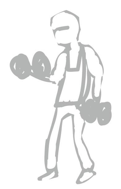
After completing the first four finals. He thought the style and technique of shading were very good and fitted with the app, and so subsequently commissioned further designs to be drawn up.


As the turn around time for one of these illustrations was around an hour each, there is very little development and change to be recorded. There were some things that were asked to be changed, for example, as the app will be aimed at all groups of people at all ages, to have a mix of characters, males and females and varying ages. I think this improves the overall feel of the illustrations, so was happy to abide.


Since giving the final files to the designer, he has sent me some screenshots and photos of the illustrations in context. Here is a screenshot of the app with the illustrations being used besides text explaining the content of the character's activities. I think that the illustrations look a lot better when in the final context and when beside the theme of the app's design it brings out the colours and brightens up the look of the window.

Another example that these illustrations were used in context was in the form of booklets advertising the apps and giving brain training tips. I think that these booklets looked very professional and I was happy with the layout of the final designs alongside the text and think the style I used fitted in very well with the feel of professionalism in the booklet.


No comments:
Post a Comment