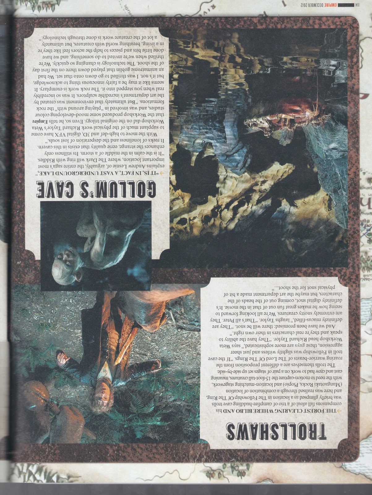
As the first chapter of Animal farm is the most famous and recognisable, I felt it was important for this illustration to be the most successful and be the most visually enticing piece, to draw the audience to want to see more of my illustrations. I think I have achieved this due to the composition and success of the doth an lighting techniques used. This illustration was used as a starting point for the style and methods for the rest of the illustrations. For example, it was on this design that I tried using the white outline behind the characters. I think that this technique works well and separates the character designs from the background, making them 'pop out'. I then decided to make this a consistent technique for the rest of the designs.

Chapter two has a scene in which the animals kick out the humans from the farm in a revolution type period. I thought that this scene would be interesting and fun to illustrate, which is why I chose that particular scene to work with. I wanted to use a colourful palette of colour for the first few chapters, especially this on, as the mood of the storyline is upbeat and hopeful as it i focusing on the potential future of the farm being a parricidal place for the animals to live. I didn't want to focus too much on how the humans look, so used techniques such as the man being half in the image, as well as the man further in the distance, and focused more on the composition and layout of the animals in the image This was a difficult task because the page is portrait, however, I think I did quite well. I didn't want to focus too much on them because the theme of the book is generally anti-human.

I wanted this scene to be the peak of the parricidal colour scheme, as it is the point in the plot in which things have reached their best, and the innocence of the characters is at it's end. It's only downhill from here. To illustrate this, I included a sun set / evening type sky to suggest that it's coming to an end. In this scene, the animals are happily doing the farm work for themselves for the first time, gaining the full benefit of their works. As not to only create directly literal designs, I included the cat sleeping on a hay bale. In the book, it is briefly mentioned that the cat is a lazy character who disappears when work is mentioned, so I thought illustrating that it perhaps sleeps all day is my own interpretation on the story.

Chapter 4 is where things start to turn ugly, so I wanted to illustrate the scene of the battle between the farmers and the animals. It is a little darker in the book as there are a number of deaths of animals and people in some scenes. To achieve this continuing change I edited the sky to be a brightly coloured sunset that had adds sense of impending doom to the scenarios. Another thing I had noticed with my designs at this point was that the character designs are consistent and are clearly continued characters from previous illustrations.

This scene seemed a bit dull and empty due to the lack of objects, this was intentional as I wanted the layout and 'flow' of the image to be the focal point of the design and if I had included objects to fill up the spaces, it would have distracted from what I wanted. I think that this scene that illustrated the change of politics for the farm is well portrayed, as the colours are dull and represents the impartial opinions of the other animals of the farm. A problem i struggled with was the consistency of the line used for the outlines of the dogs in this image. I wanted the line to consistently be at a '3 point' thickness. To combat this issue, I used the technique of having simpler shapes and less detailed designs for the dogs as the distance from the bottom of the image increases. Another issue I looked at in this image was the inconsistency of the the teeth of the dogs. At all of the group critiques and discussions, people decided that it looked good and worked well in the style I have it already. I took this feedback on board and kept it as they saw it.

This illustration of a scene from chapter 6 is where the animals are forced to work for the pigs dragging boulders up from a quarry. I wanted to take another stance on the design process and instead of having another design of a front, focal point and everything behind it, I wanted to have a more flat and less literal appearance of depth. I think it worked out okay, however it is my least favourite illustration of the 10. I chose to keep it as I had good feedback and my peers said it was successful.
I think the warping look of the shadows is a nice touch and adds another layer of consideration to the design. I think it makes the animals look overworked and adds drama to the scene.

I wanted to strongly portray a developing sense of change and darkness to my illustrations, which is a true reflection of the narrative of the book. This design of a chicken being murdered by a guard dog is a scene in the book that is very quickly brushed over, so I wanted to look a little further into the little things that build up the picture of the sense of fear and oppression on the farm. I chose to design this image differently to the others, in sense of layout, as the feedback on the previous images showed that it may have been a bit tedious seeing such literal interpretations. I designed this piece specifically to combat that idea ad personally feel it is very successful and deep in terms of content and meaning. As I had mixed feedback from peers and group crits, I thought that I would try and make the blood pool look less dark and outstanding. It was recommended that I had instead a splatter of blood, which i experimented with during the development of the design, and feel that it is better overall as a large, flat, reflective colour. Another issue with this design is that it is controversial as to considering what aged audience I am aiming at. As the book appears to be aimed at children and my style works very well with children's books, I thought it would suit this story nicely. As the book is based on the Russian revolution and focuses on political themes, using the farm as a microcosm, it is aimed at a much older and wider age group than first thought. I feel that the gory natural of my illustrations are equal to that of the themes involved in the story.

This is my illustration final for chapter 8. In the scene I have chosen to depict, there is another battle between the humans and the animals, and the humans use explosives to destroy all the animal's hard work. As this is a focal point in the story and is a climax of upbuilt drama, I wanted to give the scene a sense of horror and a hell-like feel. To accomplish this, I made the sky shades of red, representing blood and the light of the explosion from the windmill. I think that this colour palette works very well and it is what makes this illustration my favourite of the collection. I also looked at how gory to make this scene, I think that as it represents a scene from real history, that it is justified.
"Russia may have been on the winning side of World War II, but they lost huge numbers of citizens—up to 11 million soldiers in the war, and maybe even more civilian casualties. The low point came in December 1942, when the German army pushed within twenty miles of Moscow. The Soviets managed to push the Germans back and protect Hitler's next goal—their southern oil fields—but only with a lot of death and destruction.
Animal Farm has its own miniature version of World War II in the Battle of the Windmill. Frederick's men advance, take a pasture and blow up the Windmill. As the enemy rushes onto the farm, "even Napoleon seemed at a loss" (8.16). A message arrives from Pilkington telling Napoleon, "Serves you right" (8.16).
After some super violent fighting, which includes Boxer using his hoofs to smash in the heads of the men, the animals end up winning but being "weary and bleeding" (8.23). Almost immediately, Squealer begins proclaiming the war as a proud victory for Napoleon—but even dumb old Boxer doesn't quite buy it. When Squealer points out that they have regained the farm, all Boxer can say is, "Then we have won back what we had before" (8.31)."
Another area in this illustration that was mentioned in group crits was that the explosion of the windmill looks rigid. To tackle this problem, I added some 'spurts' of smoke that are being pulled away from the cloud by flying rubble. I think that this greatly improves how the movement of the image appears.

My next illustration is of a scene from chapter 9 in which the pigs in power sell the Boxer (the horse) to make money for whiskey. I wanted to not look at the main and obvious scene from this chapter, which was the animals chasing the horse box with Boxer in as it drives away and the animals being distraught, but decided to do a less literal approach to the illustration, basing it on a possible situation that was not described. This shows I am able to creatively imagine a scene for myself and depict the imagery how I wanted. As Napoleon (the leader pig) is described in the book as having the symptoms of being hung over the day after buying whiskey, I thought this was appropriate to illustrate as it reflects the situation well and is also visually composed differently to all my other deigns for this project, having a close up from above the animal's head. I have also looked into giving Napoleon more humid features in this design, as the book suggests that the pigs become more and more like humans as the plot develops.
"The pigs' discovery of whiskey has a long term result, much like it has on people. At first when the pigs discover the whiskey, they consume it and many things are heard from the farmhouse. Napoleon is declared almost dead in the morning, but by the afternoon that next day things seem to be feeling much better for him. In the long term, this finding helped alter yet another commandment of animalism and it drove the pigs to an addiction."
The final chapter is where Napoleon reveals himself to the other animals wearing human clothes, even though that was strictly forbidden by the rules of animalism. As it is a final scene, I wanted it to summarise all of the illustrations for this project. I referenced the first illustration with the cow's head poking in from the side, as well as she sheep being at the bottom of the page. I think this ties the images together nicely. I also wanted to use a colour palette that references imagery from Nazi Germany and the Russian revolution. I feel I have done this well. I have also used a direct character design from my original sketches, which is Napoleon stood proudly in his new clothes.