


When I started on my sketches and ideas for this workshop, I looked over the images and information I collected and decided to start by doing some various characters and body shapes and portraits. This would allow me to get a better grasp on what my strengths and weaknesses are in terms of proportions and facial structures. I would then look more into my possible executions of the brief.

It was stated that we had to portray the characters given to us in a realistic and historically sound way. This meant no 'traditional' ideas f witches, such as with pointy hats and broomsticks. I liked this idea of portraying an era of human history in which beliefs in the supernatural were held as genuine possibilities and I liked the challenge of showing the fear this sort of society would strike into people. It meant to me that I would have to explore ways of showing fear and pain in someones face through expressions and maybe suggesting other themes related.

The task given was to create a portrait illustration based off a real person from history accused of being a witch, therefore I felt it was important to include realistic themes, such as being burnt at the stake and methods used for execution. However, I wanted the predominant focus to be of the face and style of my illustration.

Here, I looked at my hand at drawing male's faces and their expressions. I didn't want to focus on this for too long as my given witch was an old woman.

I then sketched a few images of solemn looking women that appear to be hopeless and almost expressionless. This is because when researching Elisabeth Device, she faced capital punishment and this is how I imagine she would be feeling at the time.

Here are some more examples of me practicing sketching in a way I am not used to. I would usually sketch my basic designs on illustrator with a thick, grey brush tool. However, here I used a very thin line that gave me more control over which lines get noticed more, by going over them again adding more impact they create. This technique works well for me, especially helpful for when I am doing intricate designs such as with portraits.

My next few sketches are my experimentation of how I work when creating a portrait, as I usually don't do them, so it helped me work out what styles and features I can do well and what areas I am not so good at. I found this helpful when approaching my final designs.

Hannah Megee
I know of this illustrator mainly for her portraits of celebrities and famous actors. I like her style as it is very effective and clearly represents the subject, yet also involves her very individual style. This works well and I hope to active something along these lines in terms of success.

I admire how she uses confident lines and ever so slightly exaggerates some of the celebrity's' features. I feel that I may also use slight exaggerations for my character too.

Another thing about Megee's work that I like is the simplistic use of palettes and simple colours that still manage to bring the subject off the backdrop. I haven't thought about my backgrounds yet, but maybe will later, I feel that for portrait illustrations the background is not as important as other designs.
I then began doing images related to how I visualise Elizabeth Device to look. I used slightly thicker lines to get a more defined and characteristic look for these sketches and I feel there were helpful to refer back to for my final.

I tried to create faces that looked horrible and believable, such as the one below. I wanted the wrinkles and the texture to be imaginable in real life as that would connect with the audience more.

When doing these line sketches, I created this image below that I felt was a strong sketch in terms of line and space. I am happy with how each line is necessary and adds to the design. I then began to continue with this rough sketch to see where it lead.

I tried to make the design look like a scary old woman, as described. And I took the information available (about how she had one eye at a different angle to the other) and implemented it into the design. This is a very different style to how I would usually work on illustrator as I am used to using bold lines and block shapes and colours to create my images. However, I feel this new style is working well and will help my portfolio.

This is my final piece that I created on the day of the workshop. It was suggested by my lecturer to include a dark blue background to make the character stand out, which I feel works well with the colours I used. I decided to colour the portrait in because it adds anther layer of depth to it, as well as because I used a limited colour palette it seems spooky and ghouly. I might further look into other ways of colouring and designs for stage two but haven't decided yet.

When having my tutorial and talking about this final, it was decided that it would be a good idea for this piece to be edited more in my own style. This meant going over the image using the pen tool to create shapes that I would usually create an image in. I feel this was a good idea as it would look out of place in my portfolio and is not to the refined standard I would really have hoped for.
I am pleased with how the design (below) came out, and now need to think about ways of colouring it in the are effective and also get across the essence of fear and hopelessness that I originally intended to do.

Whilst experimenting with new ways of colouring images, I decided to try using circles and ovals as backdropped shapes to colour in large areas. I used a limited palette again and at first wasn't sure about this style and might just use it as a reference.

My next attempt at colouring this portrait in was by going over another layer with the same style I usually use to shade images in, using block colours and shapes. I used a red colour to create these shapes and the red simply to make it easier to see the areas I had affected whilst designing, however, I thought that the contrast between the red, white and black looked interesting and kept it in for a while.

Whilst reviewing the overall piece, I considered whether the translation of this character being a real person accused of being a witch was believable and clear. I thought about it and found she was executed by hanging, so thought I would add a bit more context to the piece by incorporating a noose around her neck, portraying her final moments and adding an element of scene to the image.

I tried to design the noose in my style and to be a little separate to the rest of the design. I tried using filled colours but found any way that I tried would look distracting and took away all focus and seriousness about the piece. I think that a bit of open ended suggestion about the context of the illustration adds to the style and effect that I am trying to express.

I then looked at my original plan of making the shaded areas a lot lighter and less focal to the image and made the shades skin colour. I feel this effect actually work better than the red use of the shading.

My next step was adding the base layer of colour to make the image seem more realistic and further toward my style. I think this is more of the direction that I wanted this final piece to go in in order to it in with my portfolio.

By changing the shades slightly and the colour of her clothes, I think this is the most successful combination of using this style of colouring for this image.

Before submitting the piece for grading and to commit it to my portfolio, I decided to review this design one more time, and asked a variety of peers and people to suggest ideas and to se what they thought of my designs. It turned out that the most popular design was the one in which i used circles behind my image to colour it and add an essence of surrealism to the image.


I looked back over my design and decided to rearrange the colours and selected colours to provide a more impactive look, yet maintaining the overall desire to make this piece spooky but realistic in terms of emotion.


I then tried a combination of the recent shading techniques onto of the circle colouring method and found that it worked even better. It added physical depth along with the abstract nature of the colouring technique. I then decided to make the shading a little transparent, tho makes it a little more subtle and also adds a sense of thought to the image.

I also thought that I still hadn't clearly conveyed the idea that this person was believed to be a witch. I thought about it more and remembered that in the research I did of this person it was mentioned that people often noticed her eyes were unusual. I decided to play with this idea a little more and found that by darkening her eyes to black, I made the image look a lot more spooky and deathly, yet also worked well with the colours I used. I decided to keep this for the final design as I felt it drew attention toward the middle of the face.

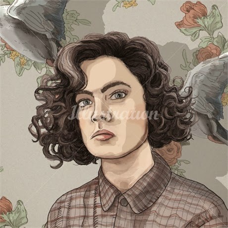
The final thing I wanted to combat was the use of the background. The previous use of a dark blue/any dark colour no longer worked with the pastely colours that I decided to use for this illustration, so I looked at other means of having a background. I looked at textures (which I never normally use) and experiment with them to see which designs worked well and which didn't. I thought this grainy texture look reminiscent of the time period in which my subject was from. I feel it adds another reference to the origin of the piece and works well.

I experimented using gradients as well as the texture but decided that it drew attention away from the real focal point.
For the final piece I decided that the textured background with no gradient would work best. I believe that I fulfilled the original brief as well as continued with my own ideas after the workshop. I used a new technique and style for colouring in, but still believe that this image still represents my style and abilities and an illustrator. I think that the colour palette I used is interesting and fits with the context of the image, as it is a scary and uneasy themed illustration.

No comments:
Post a Comment