This workshop involved a story about chicken ghosts in a man's dining room that appear for every chicken he eats (which happens to be once a day). The task was to illustrate the extract and create the atmosphere written about. I decided to research the chicken structure and it's features before illustrating. this helps with later designs and how realistic my illustrations will be.

I gathered these images to work from as references and looked at many things about these animals, including their feathers and textures, to their structures and how they stand.


Another helpful source of information about the way chickens look is from my personal life, as my family have kept chickens since I was born and I've grown up knowing what they look like and how they act. This is very helpful when drawing them as I know exactly what proportion, positions and stances they have at certain times.
(This is a photo of a Nash chicken)

Other references from my life in which I have created art based on chickens and other birds is during my A level art course. I did a module based on birds and used references to chickens in some of my sculptures and paintings (below)


I began my sketches on adobe illustrator and found this was the most helpful method of me drawing my work. I have compared my sketches from pre-tablet pencil sketches to my new digital sketches and found that digital are just as good if not better, and that it is then easier to work straight from these sketches on my mac rather than scanning the images in.

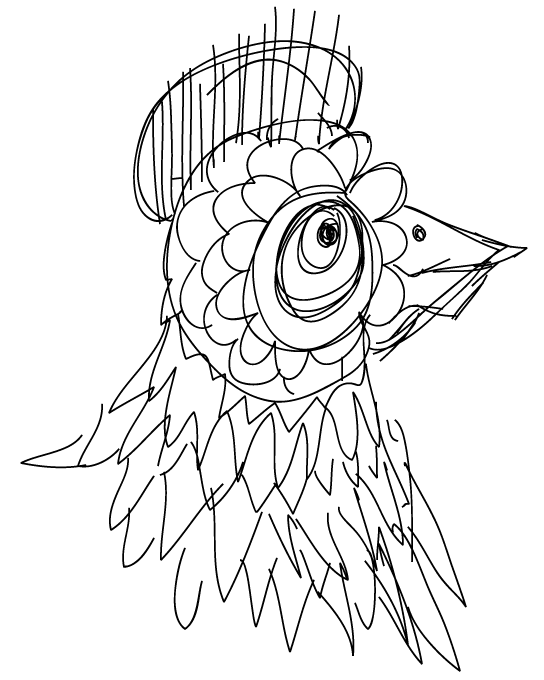
I looked at the form of the head and faces first and especially at their eyes and contrast between their bare flesh areas to their feathery areas.

I wanted to already involve my style and look at which lines and shapes are most important. This way I could simplify the illustrations down to get various styles and licence to work in any way and still resemble chickens.


I then thought about the potential designs for my final piece. I first looked at the context, and the scene set by the text. I wanted to portray what I genuinely visualise when this text is shown to me. I imagined a large man sat at a table, looking shocked at a ghostly chicken appearing at the other end of the table. I feel this is also what many other people believe when they read this text. Therefore, I wanted this to be the basis for my illustration.

I drew this man (above) as it was roughly what I imagined when I read the text. During the same workshop day, I looked round the room to see other people's ideas and views of what the illustration would be, and many of them were similar themes and designs. As more people looked at what to do to change theirs to, I kept the same idea and think having the others changing theirs made my design become more of a original idea.
I had other thought processes along side this main idea, such as the text reminding me of Edgar Allen Poe's poem of the raven. In which a raven torments the character by tapping his chamber door and haunting him. I felt I could maybe reference this poem in my work by replacing the raven with a chicken, s the themes are very similar. I drew up some sketches and gathered some reference images, but decided not to pursue that idea any further.

I then came up with looking more at my original idea of the fat man sat at the table. I cam up with these few sketches, but was very fond of the large on (below) as i feel it showed the main character and the chicken in good proportions and has a nice feel of depth to the illustration.


Joseph Shields
The more I looked at this design, the more I felt that it resembled the style of some internet cartoons that I remembered from my childhood. I researched what they could have been called and found the website they originated from. The work of Joseph Shields was always funny and clever an usually created to be interactive screens for the internet. I really like his simplistic designs and the way that he colours in his characters. Some of my favourite interactive pieces he did were things like the frog in a blender.
The more I looked at this design, the more I felt that it resembled the style of some internet cartoons that I remembered from my childhood. I researched what they could have been called and found the website they originated from. The work of Joseph Shields was always funny and clever an usually created to be interactive screens for the internet. I really like his simplistic designs and the way that he colours in his characters. Some of my favourite interactive pieces he did were things like the frog in a blender.

Another thing that my designs reminded me of was the fat man from the disney cartoon Lilo and Stitch, who was always drop his ice-cream before having a chance to eat it. I thought his proportions and style were interesting so I found this image and used it to reference when creating my final design.

Sebastian Iwohn
When thinking about colouring in my work, I researched various illustrators, but most liked the work of Sebastian Iwohn. He digitally creates work in vectors and shapes to give a layered and chunky effect, much like some of my work. I particularly liked how he doesn't include any outlines in his illustrations, and decided to adopt this technique for my illustration.

He tends to use bold and contrasting colours and I feel this is successful, so I would like to learn from this method of digital work, even though it is a bit different to how I would usually work.


For my final Illustration for this workshop, I considered all my developments and ideas planning and looked at which I felt were most successful and decided that this style and design of illustration would suit this task.
I looked back at my development and sketches of chickens and came up with these designs for potentials to be in the final piece. I wanted to finish the main image before deciding which chicken would work best with the rest of the style.

I also narrowed it don to these three chicken designs which I felt were most successful.

This was the final illustration on the day of the workshop. I was pleased with the overall outcome. I decided upon a limited palette and a simplistic but effective style involving block shapes and no lines around objects. I also like the depth and angles of the ones showing the shape of the room. I planned to continue with this design for the stage two and work on ways of improving the design.

To continue the process of improving my illustration, I looked at which chicken I really preferred and fitted witht the style and colour scheme. I changed the chicken to a rooster, I feel they were more recognisable and would it would be easily readable that it was a chicken.

I also looked at the headless chicken design. I feel this style was not as similar to the rest of the image but still work well in context. Maybe the difference in style between the chicken and the fat man is a good thing and stands out more, which would fit in with the text.

I also tried to see how the design would look in context with the text on the same image. I created a black border on the piece. I felt this would look ok as I have used black in the image for certain objects such as the chair, cutlery and plate, as well as the chicken. I chose to make the chicken black in this image to fit with the colour scheme more. I feel this is the most successful version so far.

I then got some feedback from peers and my tutors to get any ideas or suggestions. People generally liked the overall piece, however, it was suggested that I should add some shading to the main character's face. This would give it more depth and believability. I agree'd with the suggestion and implemented it into my design. Another suggestion given, which I had already considered myself was that there was a large blank area to the top right of my design, to the right of the man's head. I bought it would be a good idea to include something else to bring balance to the illustration. After discussing this, I decided to include a shelf with a chicken themed ornament on it. I used the same colours as used before, this doesn't make the new addition stand out or overpower the balance of the piece.

When returning to the class and getting feedback from the visiting lecturer and tutorial group, it was suggested to separate the character's hands in order to give him more of an expression. Although I disagree'd with these opinions, everyone else agree'd with the idea and I know that it's important to take advice on board regardless of personal opinion ...sometimes.

It was also suggested that I change the chicken on the end of the table. I really liked the previous idea of the headless chicken that was in a very slightly different style. I thought this was a good second option. After showing it to peers again they agree'd it was a better option than the first.

There wasn't much left for me to look at or add to this design. However, on further reflection of the piece, I decided it looked a little bit too flat and blocky. I combat this without changing any of the designs I looked into adding textures. I found this grain texture and applied it. I thought it looked very cool and fitted with the style and theme of the image.
I decided to tone down the power of the textures and make it less obvious (below) and I feel this is good enough to be my final design and put it in my portfolio.

I believe that this image as my final works very well and I am pleased with the overall outcome. Through careful consideration of every aspect in this illustration and thing advice and suggestions from others, I believe that this piece is now the best it can be. I believe that I have correctly fulfilled the brief. I like my use of the chose colour palette, it sets a calm but realistic mood. I think that I cannot improve this image any further. For stage 2, I believe that I continued the design and brought the illustration to the next level in terms of quality and layout.

No comments:
Post a Comment